
Daniel Zubal
Presentation Template Redesign
Client: Aliter Technologies
Year: 2025
Scope: UX Design, Visual Design
Read Time: 4 minutes
Overview: At Aliter Technologies, we faced a critical issue with brand consistency. The old presentation template was outdated, hard to use, and produced fragmented, inconsistent outputs.
My goal was simple: design a new, intuitive template that unifies the visual identity and streamlines slide creation for all employees.
The final result is an easy-to-use master template with a robust Style Guide and pre-defined slides, allowing employees to focus on content rather than design decisions. Everything is preset, saving time and ensuring full brand consistency across the organization.
The Problem
The previous template caused several recurring issues across the company:
• Visual and Brand Inconsistency: The template no longer aligned with the updated visual identity. Slides varied drastically in style and quality.
• Usability Issues: Employees found the template confusing and hard to use.
• Accessibility Problems: The text was often difficult to read due to poor contrast, inconsistent font sizes, and unclear hierarchy.
• Chaotic Outputs: Without clear rules or reusable assets, everyone created presentations “their own way,” leading to fragmented communication.
The Challenge
The goal was to design a new presentation system that:
• Fully reflects the updated brand identity
• Is intuitive even for non-designers
• Ensures visual consistency across all presentations
• Helps teams create slides faster and with less effort
Research & Discovery
To understand the real needs of employees, I conducted short interviews with team members from Sales, Marketing and HR.
Key Insights
• A “single source of truth”: Employees needed a place where they could reliably find the correct brand assets, logos, icons, colors, and components.
• Recurring content: Users frequently recreated the same types of slides (About Us, Our Clients, etc.), wasting time and introducing inconsistencies.
• Flexibility within structure: People wanted layout options but also clear boundaries to avoid design mistakes.
The Solution
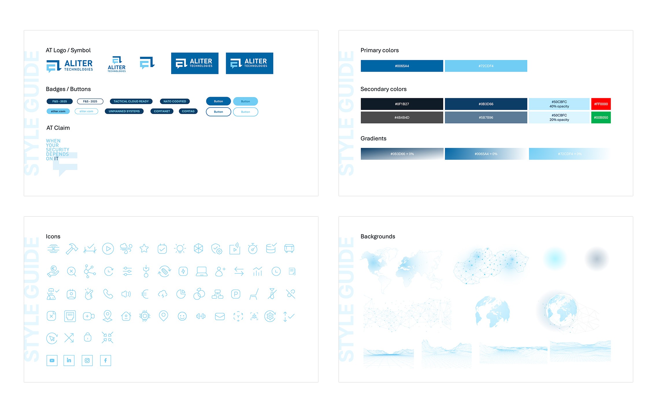
1. Built-in Style Guide
I designed a set of introductory “style guide” slides inside the template, giving users access to:
• Correct logo versions and usage rules
• Primary and secondary color palettes
• Buttons and claims
• Iconography and web-based visual assets
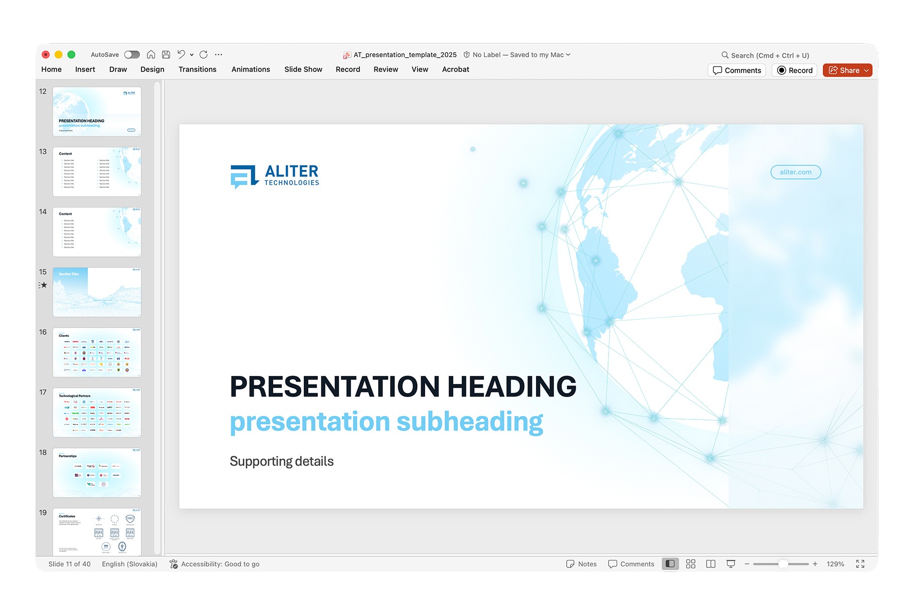
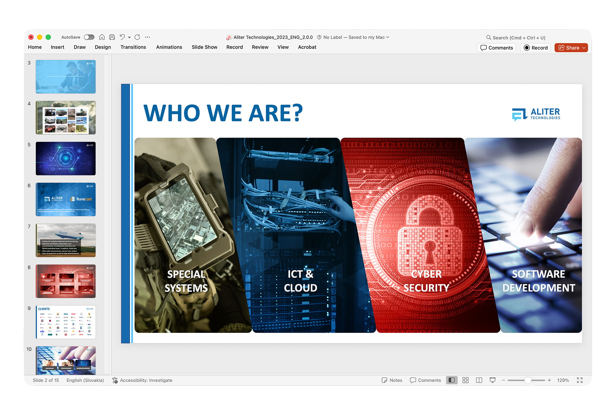
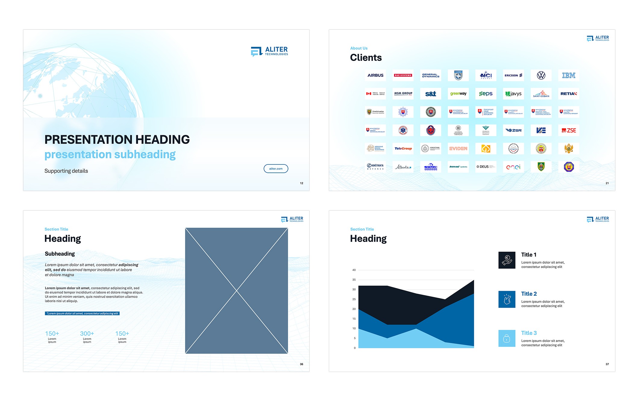
2. Flexible Slide Library
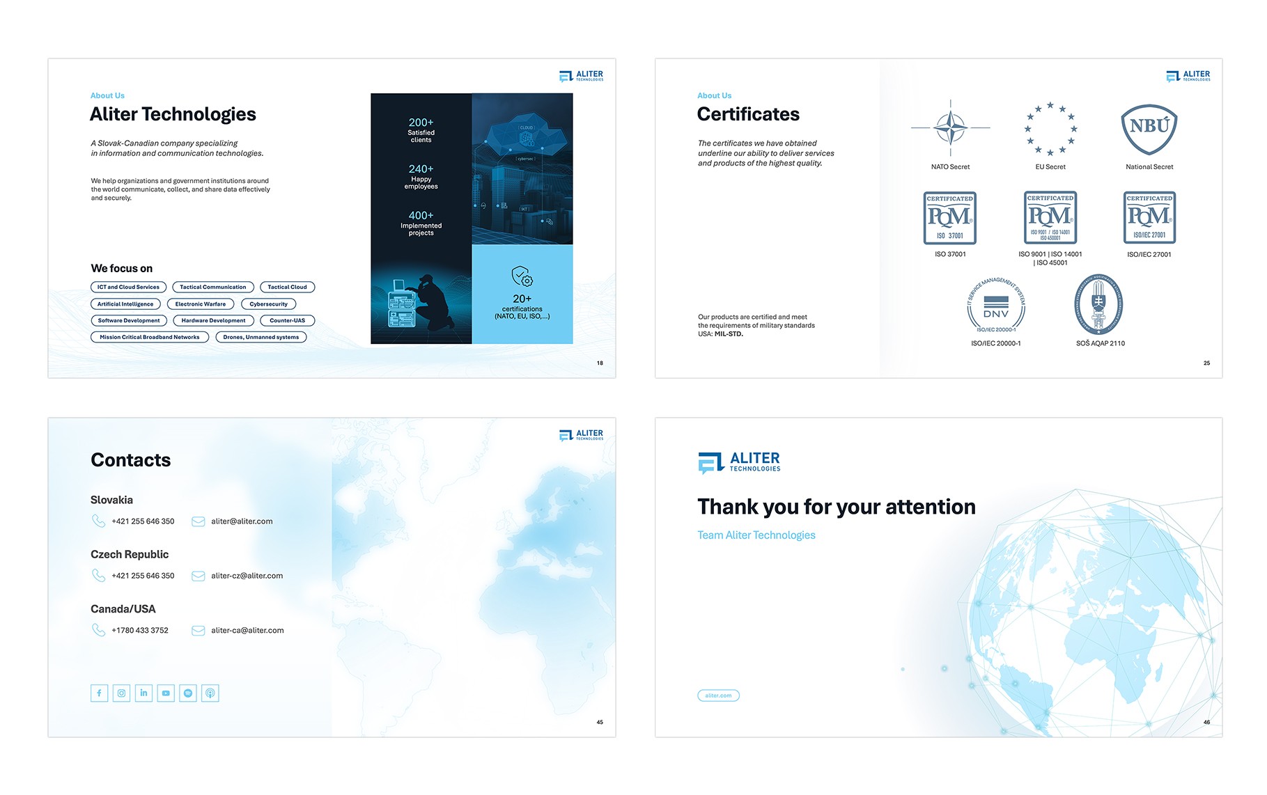
Based on user needs, I created a modular library of master slides:
• Intro slides: Multiple variants for internal, external, and event presentations
• Frequently used slides: Ready-made layouts for About the Company, Our Clients, Certificates, Team, etc.
• Content layouts: Text-only, image-only, text + image, charts, and mixed layouts, all following the same visual system
Feedback & Iteration
After delivering the first MVP, I tested it with a group of employees.
Main Issue Discovered
Users were still unsure about typography, specifically when to use which font size, weight, or color.
Iteration
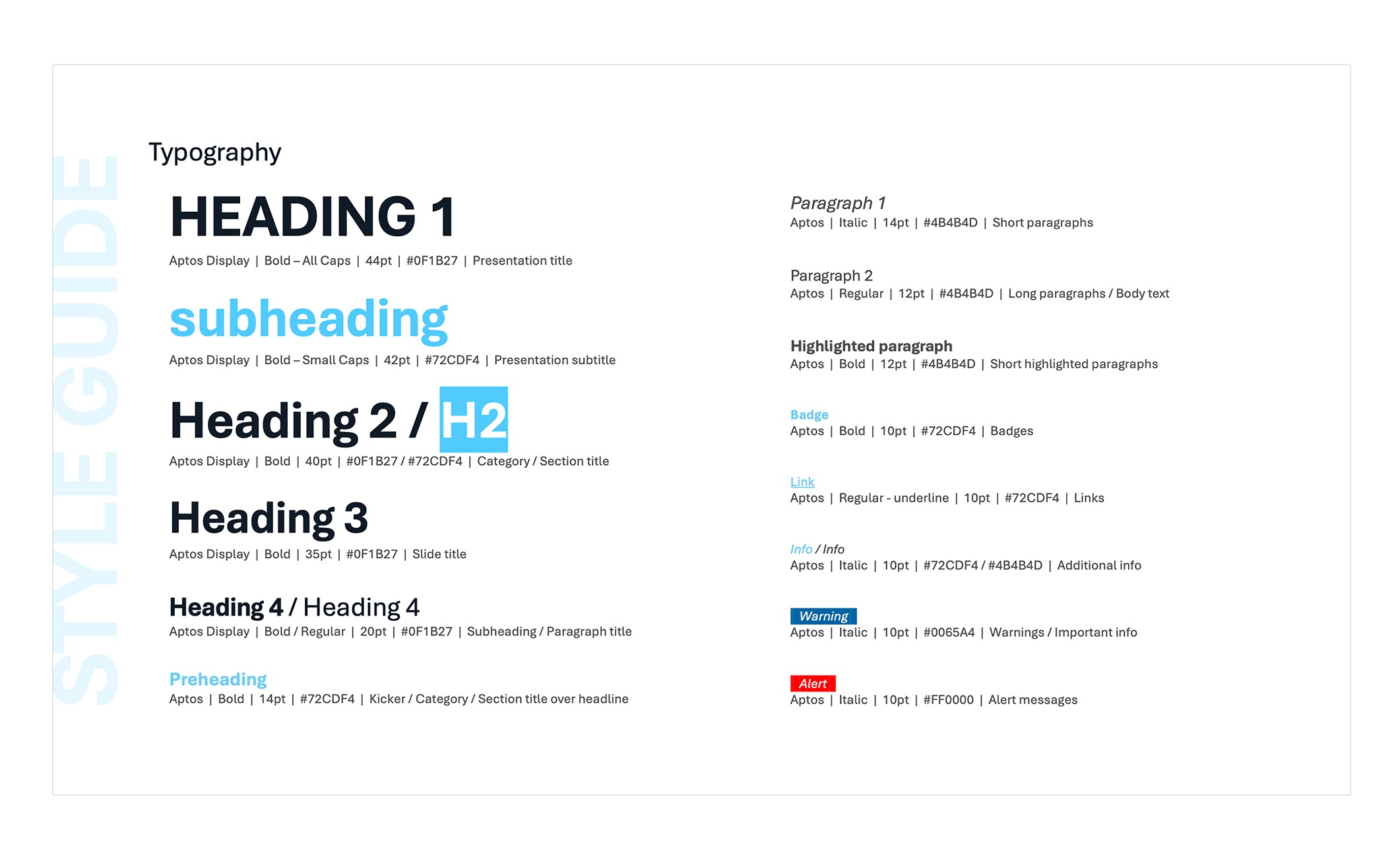
I expanded the Style Guide with a detailed typography system:
• Defined hierarchy (Heading 1, Heading 2, body text, notes)
• Clear rules for sizes, weights, and spacing
• Color usage recommendations for text
Outcome
The final template provides:
• Ease of use: Users can create slides without thinking about design rules, components are pre-built and ready.
• Brand consistency: All new presentations align with the company’s updated identity.
• Higher efficiency: Teams now build high-quality presentations significantly faster.
Learnings & Future Steps
Learnings
This project highlighted the value of clear, practical guidance. Decisions that seem obvious to designers often need to be spelled out for everyday users. Iterating based on real feedback was essential to finding the right level of clarity and usability.
Future Steps
The template remains a living system, continuously evolving with user needs. By observing how employees use it, new layouts, components, and improvements are added to simplify workflows, enhance flexibility, and make the system genuinely useful in day-to-day work. This iterative approach ensures the tool adapts and grows alongside the company.

Daniel Zubal
Presentation Template Redesign
Client: Aliter Technologies
Year: 2025
Scope: UX Design, Visual Design
Read Time: 4 minutes
Overview: At Aliter Technologies, we faced a critical issue with brand consistency. The old presentation template was outdated, hard to use, and produced fragmented, inconsistent outputs.
My goal was simple: design a new, intuitive template that unifies the visual identity and streamlines slide creation for all employees.
The final result is an easy-to-use master template with a robust Style Guide and pre-defined slides, allowing employees to focus on content rather than design decisions. Everything is preset, saving time and ensuring full brand consistency across the organization.
The Problem
The previous template caused several recurring issues across the company:
• Visual and Brand Inconsistency: The template no longer aligned with the updated visual identity. Slides varied drastically in style and quality.
• Usability Issues: Employees found the template confusing and hard to use.
• Accessibility Problems: The text was often difficult to read due to poor contrast, inconsistent font sizes, and unclear hierarchy.
• Chaotic Outputs: Without clear rules or reusable assets, everyone created presentations “their own way,” leading to fragmented communication.
The Challenge
The goal was to design a new presentation system that:
• Fully reflects the updated brand identity
• Is intuitive even for non-designers
• Ensures visual consistency across all presentations
• Helps teams create slides faster and with less effort
Research & Discovery
To understand the real needs of employees, I conducted short interviews with team members from Sales, Marketing and HR.
Key Insights
• A “single source of truth”: Employees needed a place where they could reliably find the correct brand assets, logos, icons, colors, and components.
• Recurring content: Users frequently recreated the same types of slides (About Us, Our Clients, etc.), wasting time and introducing inconsistencies.
• Flexibility within structure: People wanted layout options but also clear boundaries to avoid design mistakes.
The Solution
1. Built-in Style Guide
I designed a set of introductory “style guide” slides inside the template, giving users access to:
• Correct logo versions and usage rules
• Primary and secondary color palettes
• Buttons and claims
• Iconography and web-based visual assets
2. Flexible Slide Library
Based on user needs, I created a modular library of master slides:
• Intro slides: Multiple variants for internal, external, and event presentations
• Frequently used slides: Ready-made layouts for About the Company, Our Clients, Certificates, Team, etc.
• Content layouts: Text-only, image-only, text + image, charts, and mixed layouts, all following the same visual system
Feedback & Iteration
After delivering the first MVP, I tested it with a group of employees.
Main Issue Discovered
Users were still unsure about typography, specifically when to use which font size, weight, or color.
Iteration
I expanded the Style Guide with a detailed typography system:
• Defined hierarchy (Heading 1, Heading 2, body text, notes)
• Clear rules for sizes, weights, and spacing
• Color usage recommendations for text
Outcome
The final template provides:
• Ease of use: Users can create slides without thinking about design rules, components are pre-built and ready.
• Brand consistency: All new presentations align with the company’s updated identity.
• Higher efficiency: Teams now build high-quality presentations significantly faster.
Learnings & Future Steps
Learnings
This project highlighted the value of clear, practical guidance. Decisions that seem obvious to designers often need to be spelled out for everyday users. Iterating based on real feedback was essential to finding the right level of clarity and usability.
Future Steps
The template remains a living system, continuously evolving with user needs. By observing how employees use it, new layouts, components, and improvements are added to simplify workflows, enhance flexibility, and make the system genuinely useful in day-to-day work. This iterative approach ensures the tool adapts and grows alongside the company.